
 Tweet
Tweet
I'm putting a stop to all those "No progress!" topics on the boards. There's only one sure fire way to make sure they're stopped and that's, as you might've guessed, by showing off some progress! Don't get too keen to see lots and lots and lots, because I'm currently having severe Internet issues and it takes a whole lot of pain and effort just to get near posting and getting images uploaded.
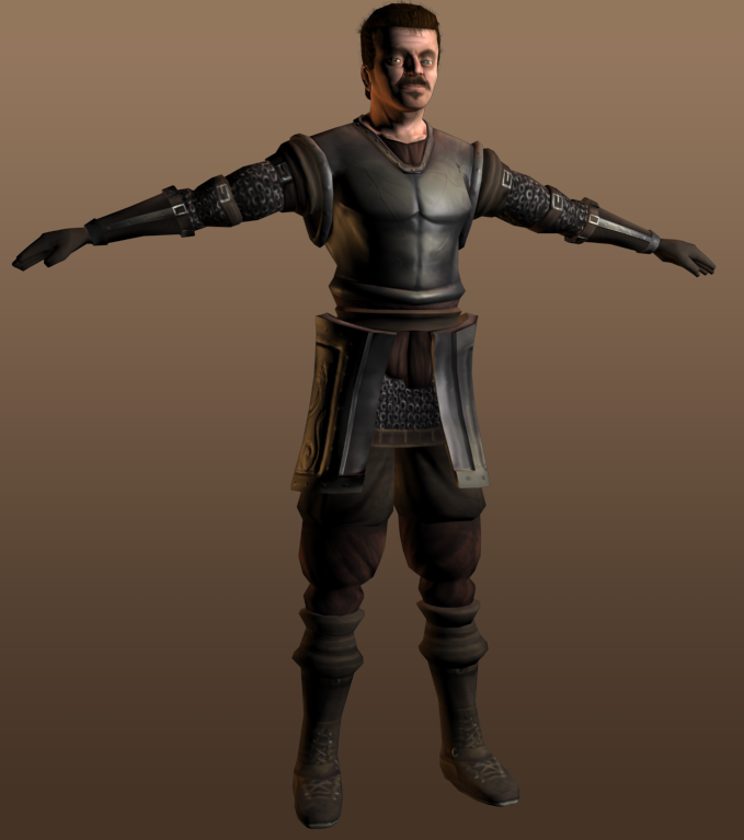
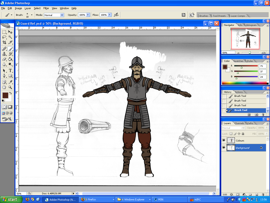
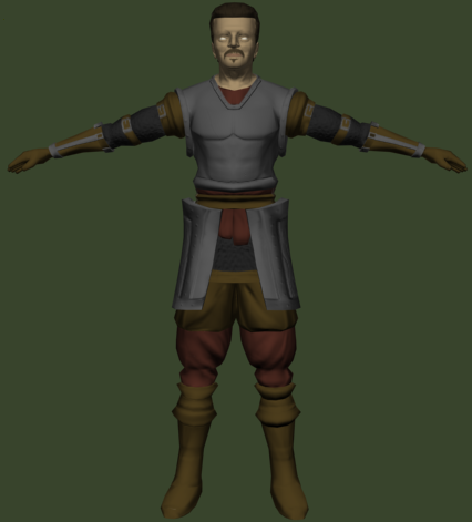
I've been quietly working away on environment models since the end of the summer. The first few were done very slowly after a moderate attempt at a table and a guard. The table needs to be improved a bit still while the guard showed promise, but in the end I think character models are best left to the more experienced modellers on the team. I ended up running into plenty of difficulties with Zbrush and normal maps on the guard. You'll all have to jump onto Illuminus's back and give him a kick up the arse to get a guard model done and dusted.
Since then I've been working non-stop on general objects, which I've become much quicker at doing. I've started on the big stuff and will be moving downwards to the small stuff like jewellery, cutlery and other minor items. I would've shown more samples, but the connection I am on simply cannot handle it.
Here are a few examples of the household furniture that will grace the manors of snobby toffs, the coach houses for wealthy merchants and, of course, the palaces the smarmy dukes, earls, lords and ladies of the land, the biggest prize in the world!
Upper Class - Dining Table
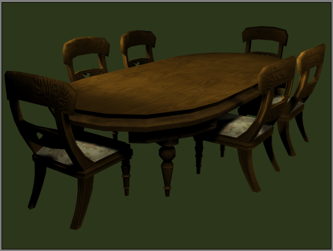
First off is a middle class table and chairs. I've separated my list of objects into lower, middle and upper class. The most common objects will have different class equivalents. Not only is this for the sake of trying to make it realistic, but it should also be a handy indicater of where the best loot is on a level. If you see really slick looking chairs with lots of patterns and smoothly plained wood, you know you've hit the big time! The poor equivalent of this table would be a tatty old piece of wood with a couple of stools next to it. You get the idea.
Table - 864 triangles and one 1024 texture.
Upper Class - Dining Chair
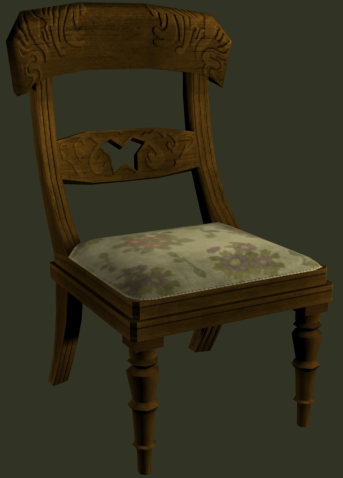
Here is a close up of upper class dining chair. I've spiced it up with some fancy patterns and flowers. If it doesn't look comfortable to you, don't you worry, I've already made a big, warm and comfy armchair as an alternative. 860 triangles and one 1024 texture.
Upper Class - Chaiselongue
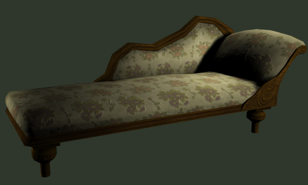
"Tell me about your parents..."
The chaiselongue is a must for any excessively wealthy snob. It's a part of a set to go with the chairs. The flower pattern design was in that year. No giant manor is complete without this gorgeous accessory, whether it's to lie on or hide behind. 950 triangles and one 1024 texture.
Upper Class - Grand Piano
This is the big one, the centrepiece of any 19th century mansion. It's by far the largest object model so far, but I thought it was worth giving it all its details. There'll probably won't be more than one on any level. You can see all of the inside of the piano here, but you can't close the lid or anything. It's fixed.
A pinch at 1,872 triangles with two 1024 textures. When it comes to map making, I hope you'll all use it sparingly.
Unfortunately I was hoping to far have more to show, but I've been let down by successive "uploads failed". If I can get more images up I'll have them on here for future posts. Thanks to Illuminus for uploading a couple for me. But keep the smiles and faith up because the game is coming along, even if it doesn't sound like it.
Enjoy
I've been quietly working away on environment models since the end of the summer. The first few were done very slowly after a moderate attempt at a table and a guard. The table needs to be improved a bit still while the guard showed promise, but in the end I think character models are best left to the more experienced modellers on the team. I ended up running into plenty of difficulties with Zbrush and normal maps on the guard. You'll all have to jump onto Illuminus's back and give him a kick up the arse to get a guard model done and dusted.
Since then I've been working non-stop on general objects, which I've become much quicker at doing. I've started on the big stuff and will be moving downwards to the small stuff like jewellery, cutlery and other minor items. I would've shown more samples, but the connection I am on simply cannot handle it.
Here are a few examples of the household furniture that will grace the manors of snobby toffs, the coach houses for wealthy merchants and, of course, the palaces the smarmy dukes, earls, lords and ladies of the land, the biggest prize in the world!
Upper Class - Dining Table
First off is a middle class table and chairs. I've separated my list of objects into lower, middle and upper class. The most common objects will have different class equivalents. Not only is this for the sake of trying to make it realistic, but it should also be a handy indicater of where the best loot is on a level. If you see really slick looking chairs with lots of patterns and smoothly plained wood, you know you've hit the big time! The poor equivalent of this table would be a tatty old piece of wood with a couple of stools next to it. You get the idea.
Table - 864 triangles and one 1024 texture.
Upper Class - Dining Chair
Here is a close up of upper class dining chair. I've spiced it up with some fancy patterns and flowers. If it doesn't look comfortable to you, don't you worry, I've already made a big, warm and comfy armchair as an alternative. 860 triangles and one 1024 texture.
Upper Class - Chaiselongue
"Tell me about your parents..."
The chaiselongue is a must for any excessively wealthy snob. It's a part of a set to go with the chairs. The flower pattern design was in that year. No giant manor is complete without this gorgeous accessory, whether it's to lie on or hide behind. 950 triangles and one 1024 texture.
Upper Class - Grand Piano
This is the big one, the centrepiece of any 19th century mansion. It's by far the largest object model so far, but I thought it was worth giving it all its details. There'll probably won't be more than one on any level. You can see all of the inside of the piano here, but you can't close the lid or anything. It's fixed.

A pinch at 1,872 triangles with two 1024 textures. When it comes to map making, I hope you'll all use it sparingly.
Unfortunately I was hoping to far have more to show, but I've been let down by successive "uploads failed". If I can get more images up I'll have them on here for future posts. Thanks to Illuminus for uploading a couple for me. But keep the smiles and faith up because the game is coming along, even if it doesn't sound like it.
Enjoy


![]>CoD<[Chief](data:image/svg+xml;base64,CgkJCTxzdmcgeG1sbnM9J2h0dHA6Ly93d3cudzMub3JnLzIwMDAvc3ZnJyB2aWV3Qm94PScwIDAgNTAgNTAnPgoJCQkJPHJlY3Qgd2lkdGg9JzEwMCUnIGhlaWdodD0nMTAwJScgZmlsbD0nI2RjOTlhOScgLz4KCQkJCTx0ZXh0IHg9JzUwJScgeT0nNTAlJyBmaWxsPSd3aGl0ZScgZm9udC13ZWlnaHQ9J2JvbGQnIGZvbnQtZmFtaWx5PSdBcmlhbCcgZm9udC1zaXplPSczMDAlJyBkb21pbmFudC1iYXNlbGluZT0nY2VudHJhbCcgdGV4dC1hbmNob3I9J21pZGRsZSc+XTwvdGV4dD4KCQkJPC9zdmc+CgkJ "]>CoD<[Chief")


Comment